Built.io – The Process Behind the 2017 Site Refresh
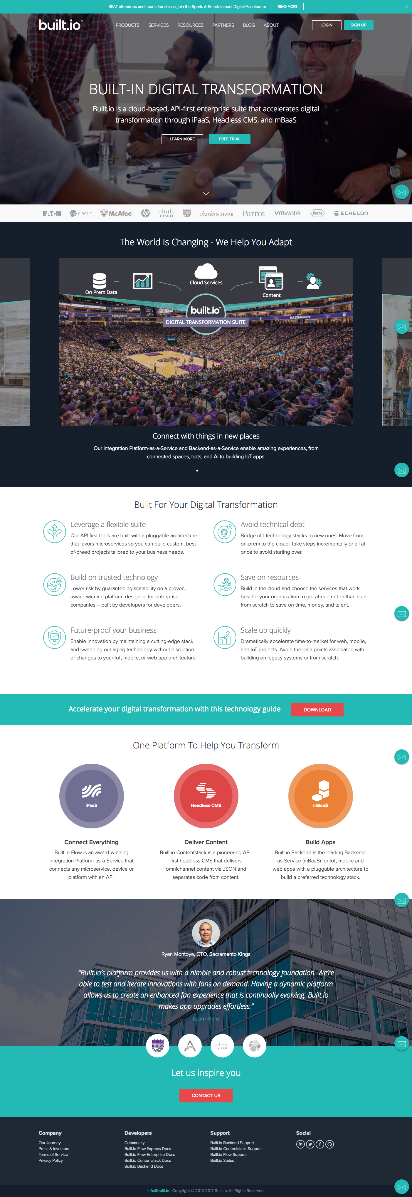
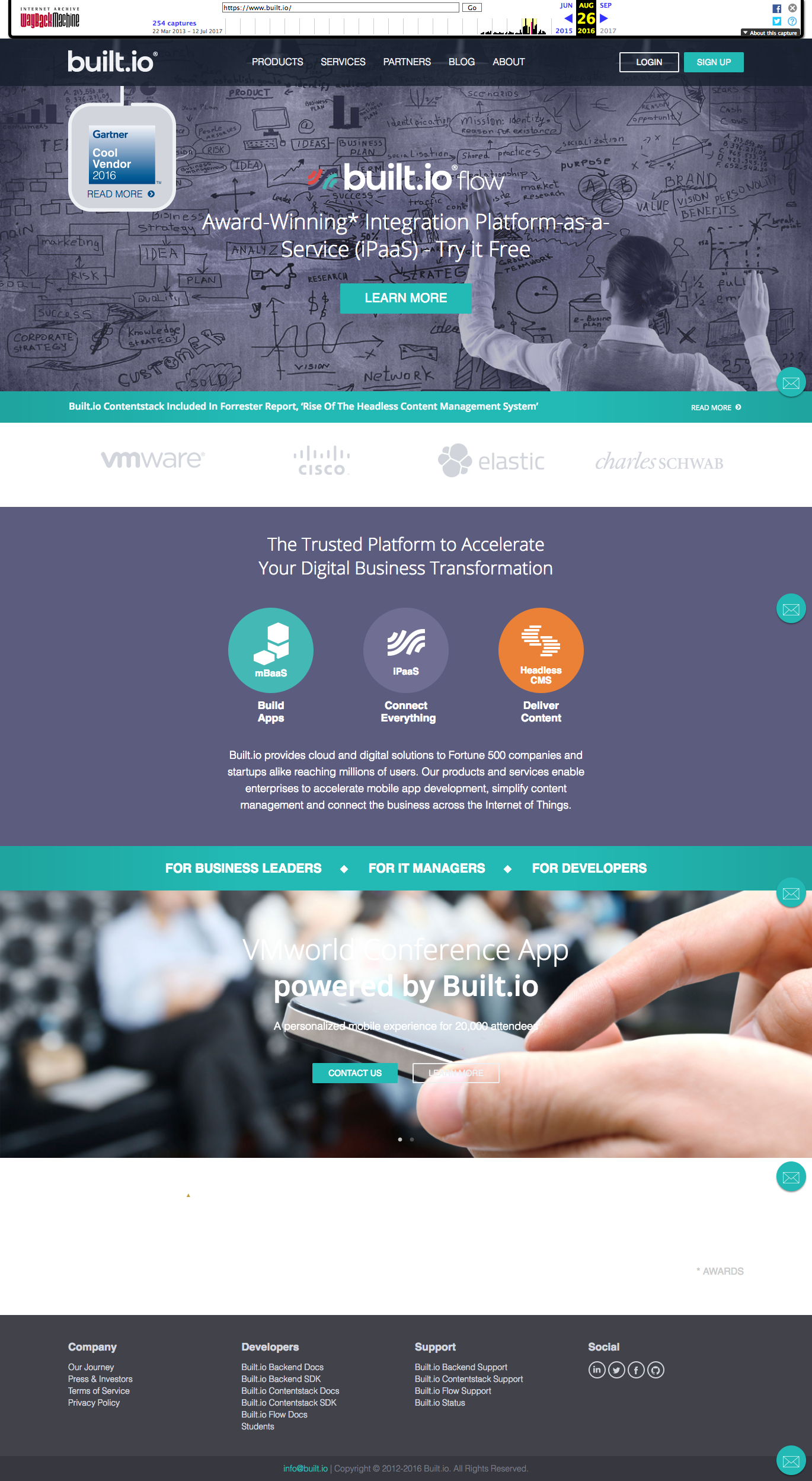
When I joined Built.io, I was handed over an old website that did not reflect our newer technology. I launched two updates to the home page is phases after doing a content audit and many strategy sessions. Phase 1 reflected a banner that was supposed to convey connectivity for the flagship product, Built.io Flow. I reasoned that we should us a graphic because that was the easiest way to explain how the product worked. In phase 2, I expanded the creative direction to include all of the verticals we touched and also worked to reflect that we were now considering ourselves a complete enterprise suite composed of three products. To do this, I focused on the end results and benefits that we provided and opted for a video banner to help communicate the ideas faster. Each benefit listed (ex: “Built-in agility, automation and bots, speed to market, digital transformation, etc.” is tied to a specific industry, vertical or use case.


